Seascape - Asturias coast, Spain. Slawek Staszczuk Photography.

Composition in landscape photography

INTRO

Why is landscape photography difficult?

Many beginners, and even seasoned photographers specialising in other areas, struggle with landscape photography. Composition is probably the number one cause of their frustration. So often it’s not obvious at all what should be the focus of your frame. You have to create it, craft through your creative choices. The use of lighting, perspective, angle of view, the resulting arrangement and visual hierarchy of objects in the scene.

Spring morning on the South Downs near Brighton - how to approach composition in landscape photography.

Spring morning on the South Downs near Brighton.

I faced the same struggles when I switched my attention from wild bird photography to landscape around 2007. Even though I’d always loved nature and the great outdoors, I didn’t understand or “see” landscape as a subject for photography at that time. Consequently, my early attempts at it were quite mediocre and disheartening.

Today I feel I’ve come a long way since then and would like to share with you some of the “discoveries” I’ve made during my journey. Plus, I also hope this short article will encourage you in your efforts. I do believe the ability to take decent landscape images is an acquired skill, not a question of some innate talent. Anyone with eyes to see can learn how to create meaningful landscape compositions.

Composition “rules” and their purpose...

A number of rules regarding composition exist in the photography world. They’ve been around for a long time and are shared between generations of photographers. Most notably “the rule of thirds”. Another example would be “don’t put your horizon in the middle”, “avoid centrality (don’t put the main subject in the middle of the frame” etc.

In my mind, these and similar tenets are not rules at all, not even rules meant to be broken, but guidelines. They can be very helpful for beginners struggling with composition, who don’t know where to start. Especially for people who get into photography without any art background. But they’re not some arbitrary commandments that need to be satisfied “just because”. They serve a higher purpose, which is to create interesting, compelling, dynamic images. If you can imbue your pictures with those qualities without following any of the “rules”, there’s no reason not to do it.

Autumn in the West Sussex countryside. Depth in landscape photographs.

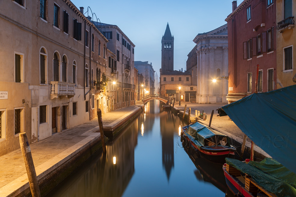
Misty dawn in Dorsoduro, Venice.

While these guidelines are indeed often a good starting point, if you assume them as your modus operandi for the rest of your photographic life, the approach inevitably becomes formulaic. Tone-deaf even, if you never stop to think about why you are doing those things. For that reason, I’m not going to spend any more time discussing them.

I also see no point in trying to enumerate the myriad of possible compositional devices. Such a list will always be incomplete and needlessly casuistic. Instead, I’d like to share with you a more abstract approach to composition in landscape photography.

MY COMPOSITION IDEALS

A few years ago, when preparing a new presentation for camera clubs, I’d “reverse-engineered” my process of finding and refining compositions in landscape. When I’m out there in the field, often having to make quick decisions as the conditions change and bring brief opportunities. I work intuitively, on an almost subconscious level. In order to distill what I try to achieve, I had analysed an array of photos that I deemed successful, and came up with a few fundamental qualities most of them had in common.

Now, these are not “rules”, but rather ideals I strive towards. They’re of a higher order or level of abstraction than any possible rules. These are also the same qualities I appreciate and admire in other photographers’ work. Here’s the list:

  1. Balance / visual harmony / sense of proportion
  2. Simplicity
  3. Readability / Clarity
  4. Impact

Balance

WHAT IS A BALANCED COMPOSITION

When I consider balance and what I mean by that term, it becomes clear why the “rules” have had such an enduring appeal. They are objective. There is no debate where a line a third from the left would lie. And where a similar imaginary line a third from the bottom would exist. And where they would intersect. Your “strong point” either lies on or near the intersection, or it doesn’t. Case closed. The same goes for horizon in the exact middle on the Y axis, or a vertical shape in the exact centre on the X axis. With this approach, the appropriate measurements can be easily made and, based on them, the scrutinised image approved or rejected.

Brighton beach - simple and impactful landscape photography composition

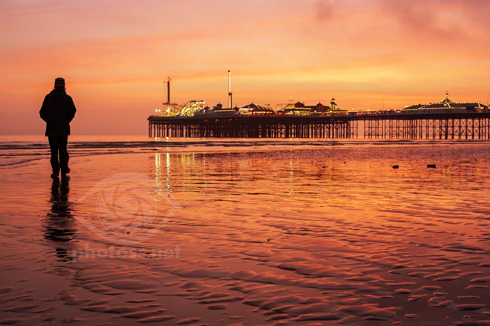
Afterglow on Brighton beach.

A very simple composition with only two main elements: the silhouette of the dog walker and its reflection in the wet sand, and the silhouette of the pier. I tried to arrange them in the frame in such a way that they balance each other out. Everything else in the frame is textures and secondary details.

The main elements are clearly defined, mostly thanks to strong contrast, and to a degree also because they’re set against soft, “low frequency” backdrops. Because it’s so simple and the major shapes so clearly defined, the picture is very easy to read at a glance.

Tonal contrast is also the primary factor behind the impact of this scene.

Balance and proportion are much more fluid. And while I don’t believe they’re entirely subjective (there are some universal standards of beauty we all seem to share), they can’t be easily measured or calculated. Because of that, I can only “define” what a balanced composition means to me through the use of some descriptive terms.

Normally, you’ll have a few main elements in your frame – the major shapes. When they are well balanced, no element feels too heavy or too empty. Too large or too small, too squished, or redundant, or overwhelming. Everything is exactly in its place and contributes to the composition. I realise this sounds very wishy-washy. But there are a few little tricks that can help you judge the balance and proportions in the frame.

THE SQUINT TEST

Firstly, because balance has a lot to do with tonality of individual areas in the frame, you could use the “squint test” to more easily judge how those areas work together. If you intentionally blur your vision (I find closing one eye and half-closing the other works best), you’ll be better able see your scene in terms of basic values, or different levels of light intensity.

Evening in York. Balance in a cityscape composition.

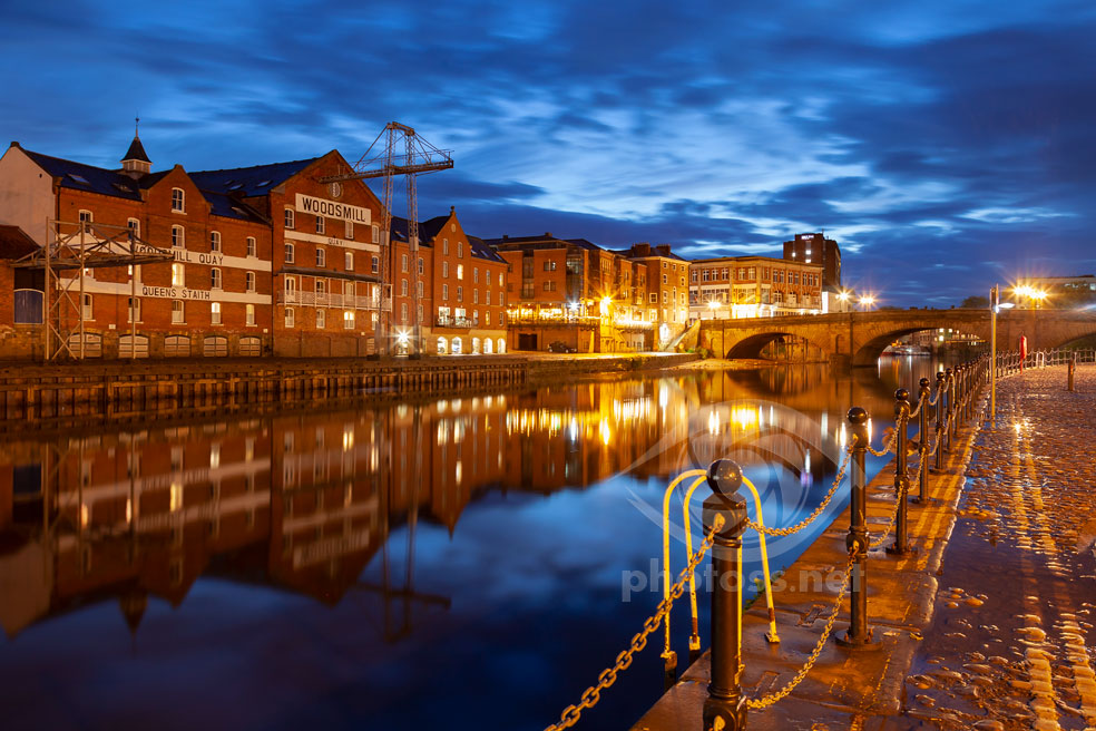
Dusk on river Ouse in York.

In this Blue Hour scene, I tried to arrange all the elements in the frame so they would form a harmonious, cohesive whole. Leaving just enough “headroom” above the skyline, so that the cloudage above wouldn’t feel too squished, or too overbearing. Including “the right” amount of the wharf on the left.

I strove to make the main areas proportionate to the rest of the image, make them balance each other out. I avoided overly bright or dark surfaces, which would unbalance the composition. But I didn’t try to apply specific arbitrary divisions within the frame and fit the main elements withing them.

Since the dynamic range of our eyesight is much broader than the camera’s, we get easily distracted and often fooled by the colours and details in the scene. If you simplify everything down to blocks of different brightness levels, it becomes easier to assess how those areas work together. Whether anything sticks out too much or is too small, too weak. Whether any elements feel too tight, or there’s too much “empty” space between them.

FLIP, ROTATE, FLIP AGAIN

Afterwards, when viewing your images on a  monitor, it can be very helpful to flip them vertically or horizontally. Or rotate them 90° one way or the other. We get used to seeing things a certain way, especially when we’ve been working on an image for a longer time, and lose perspective. Making those temporary changes will give you a fresh perspective and often let you see problems, imbalances, that would otherwise remain hidden to your eyes. So, it makes sense to memorise the keyboard shorts for flipping and rotating, or create your own if that’s possible in the software you use.

Simplicity

AVOID BUSYNESS

“Avoid busyness” is a piece of advice I remember from a series of video tutorials on photography by some American photographer, which I watched almost two decades ago. I don’t remember the host’s name, or his photos, or anything else from that tutorial. But this one bit has stuck with me, since it is simplicity itself – just two words to memorise.

And these words are well worth remembering and applying to your landscape photography. Busyness is usually the antithesis of simplicity in composition. Many scenes or environments are naturally busy (e.g. woodlands), and it is our job and challenge to simplify them in the frame – through arrangement, choice of perspective, use of lighting, atmosphere etc.

SIMPLER = EASIER TO COMPOSE, EASIER TO READ

Simpler compositions tend to be easier to read for the viewer. They often have more impact as well, or at least a higher potential for creating impact. And for us they are typically easier to balance, as we have fewer elements to juggle.

Lastly, simplicity is a spectrum. It’s probably much easier to create a composition that is too complex and busy. But we can also go too far in the opposite direction. There’s nothing simpler than a stretch of cloudless sky or a featureless concrete wall filling the entire frame. But they clearly don’t make for interesting compositions…

Foggy park. Landscape composition - a woodland scene.

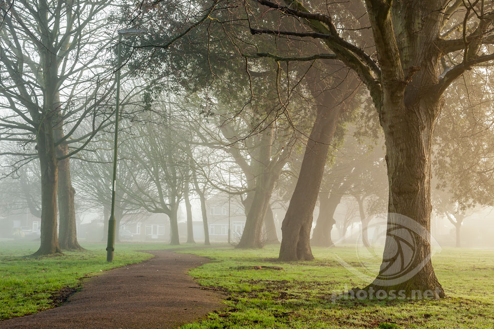
Winter morning in Southwick, West Sussex.

A fairly “pedestrian” spot in the suburbs of Brighton; usually quite busy, compositionally speaking – there are lots of cars and houses along the street that surrounds this patch of green.

Fog hid most of the busyness, thus simplifying the composition. It helped me achieve better separation and definition, especially on the foreground tree. The atmospheric content also made it much easier to create a stronger visual hierarchy and better sense of depth.

Readability

Or clarity – I believe these two words are practically interchangeable in this context. It’s about how well your image “reads”, or how clear the composition is to the viewer. How well defined the main shapes are. Whether there is a clear visual hierarchy, or different elements are fighting for attention.

Blackdown in West Sussex. How to achieve a clear, readable composition in landscape photography.

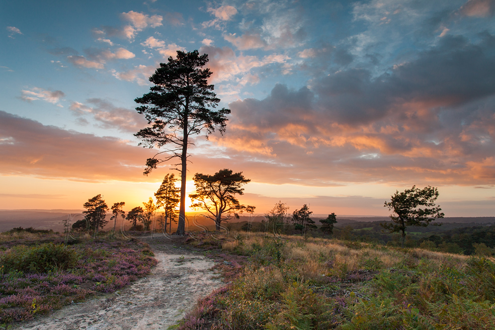
Sunset on Blackdown, West Sussex.

The main focus of the frame, the tallest pine tree against the setting sun, is very clearly defined. All the secondary elements, the smaller and more distant trees, also have good definition. All thanks to strong contrast. The rest of the frame – the footpath, the heath, the cloudscape – provide a context and a backdrop. The scene overall is quite simple and easy to read at a glance.

It’s not necessary for the viewer to instantly recognise what she’s looking at, as it could be an abstract image. But if the main shapes and the dynamics they create are obvious, the composition will be more readable.

ON LOCATION

You can achieve these goals through the use of lighting, contrast, colours. By choosing angles, vantage points and moments when key elements of your scene are set against contrasting backdrops. Once you’ve managed to set the stage for the main players and you have more than a second to capture something special, it may pay off to keep tweaking the frame so as to create better definition for secondary elements – local or “micro” compositions.

ON SCREEN

I find that in order to better judge clarity afterwards, in editing, it’s usually helpful to look at the images from a distance. or at their miniature versions (which will serve exactly the same purpose). We often bring whole series of similar pictures from our outings and trips. Applying the “miniature test” to them will help you find the most readable, balanced and probably the most impactful image among them.

Naturally, simpler and more balanced compositions will typically be also more readable to the viewer. They also tend to have more impact.

Impact

Or how striking and arresting the image is. This is often to do with the use of tonal contrast – setting dark elements against bright surroundings or vice versa. But it also could be the result of skillfully juxtaposing any opposing, or at least drastically different, qualities.

Snowy dawn in Sappada, Dolomites. Impact through colour juxtaposition.

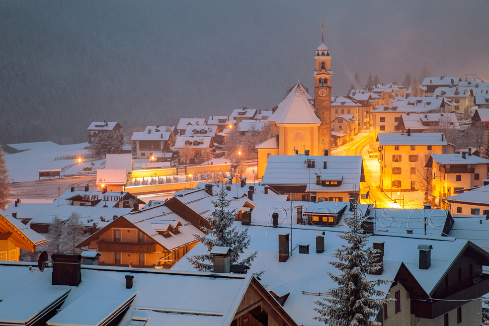
Dawn in Sappada, Dolomites.

Most of the previous examples derived their impact from tonal contrast, which is arguably the easier way to achieve it. In this instance, the contrast isn’t so strong and I feel the effect results mostly from the juxtaposition of warm hues in the middle of the village playing against the coolness of the snow reflecting the skylight.

A strong vertical shape against the backdrop of predominantly horizontal lines in the frame. A warm-coloured object against surrounding coolness. Strong angular man-made forms against organic flowing shapes of nature. Something tiny set against the enormity of surrounding elements. I’m sure you can think of a number of other similar abstract examples.

The impact will often be greater if you manage to combine two or more opposing qualities playing against each other at the same time. Like a warm, dark, vertical shape set against cool, bright surroundings full of horizontal lines.

ORDER OUT OF CHAOS?...

Although busyness in the composition normally doesn’t lead to striking images, in some situations it can possibly be turned into an asset. For example, woodlands are usually very busy, full of similar looking trees,. But if you find an old, twisted, gnarly tree, leaning at an unexpected angle and you set it against the busy, dense background of younger trees, the resulting juxtaposition could still create impact. The busyness of the backdrop becomes little more than a “texture”.

What next...

It’s probably obvious by now that the “ideals” I try to achieve when creating my compositions in landscape photography are closely interconnected and intertwined. More balanced compositions tend to be more readable; simplicity and impact usually go hand in hand.

Likewise, composition itself doesn’t exist in a vacuum and cannot be neatly extricated from its context – of lighting, colour harmonies, linear perspective, atmospheric content, environment etc. I’ve written a handful of articles detailing my approach to and use of many of these building blocks of landscape photography. You can browse them here.

Early summer on the South Downs in West Sussex.

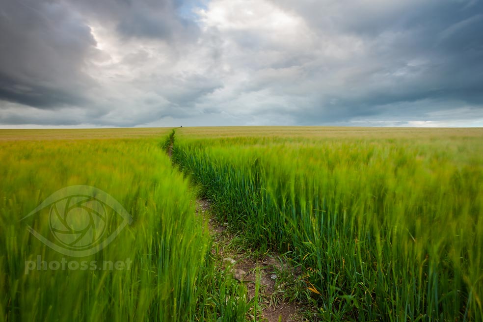
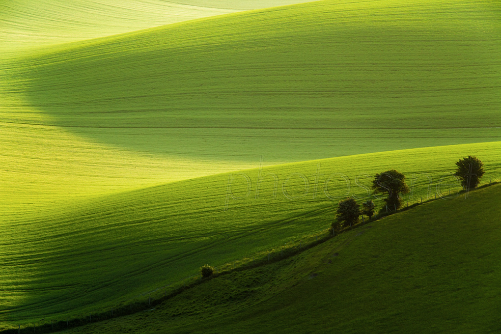
South Downs in early summer.

Lastly, I believe that once you’ve mastered the basics, the best way to learn all aspects of landscape photography is to study and analyse images that you admire and find inspiring. Perhaps keeping a journal or a digital scrap book could be useful. Committing your thoughts and observations to paper may help you solidify your growing visual vocabulary and knowledge, as well as discern any emerging patterns much more easily.

Thank you for reading. Check out other similar articles in my Landscape Photography is Simple “blog”. Or click on a random post below.

Leave a Comment

Your email address will not be published. Required fields are marked *